![VeryGoodCopy [Small].png](https://images.squarespace-cdn.com/content/v1/5615edeae4b0b9df5c3d6e90/1552608199947-3JLSND9PYXWOR5Y4PN81/VeryGoodCopy+%5BSmall%5D.png)

Research, copy, design.
Research, copy, design.
Research, copy, design.
Why?
Because each step has a unique, cumulative purpose:
Research informs the copy.
Copy sells the product.
Design sells the copy.
Yes…
The purpose of design is to sell the copy.
In other words, your design must support your message, your words. It must help the audience read and understand your copy.
After all, if the words don’t get read, the ad is (usually) dead in the water.
Here’s an example that illustrates exactly what I mean…
![VeryGoodCopy [Small].png](https://images.squarespace-cdn.com/content/v1/5615edeae4b0b9df5c3d6e90/1552609132374-53CRS2GW1OIUQQNQNV7Z/VeryGoodCopy+%5BSmall%5D.png)
JOIN THOUSANDS OF SUBSCRIBERS


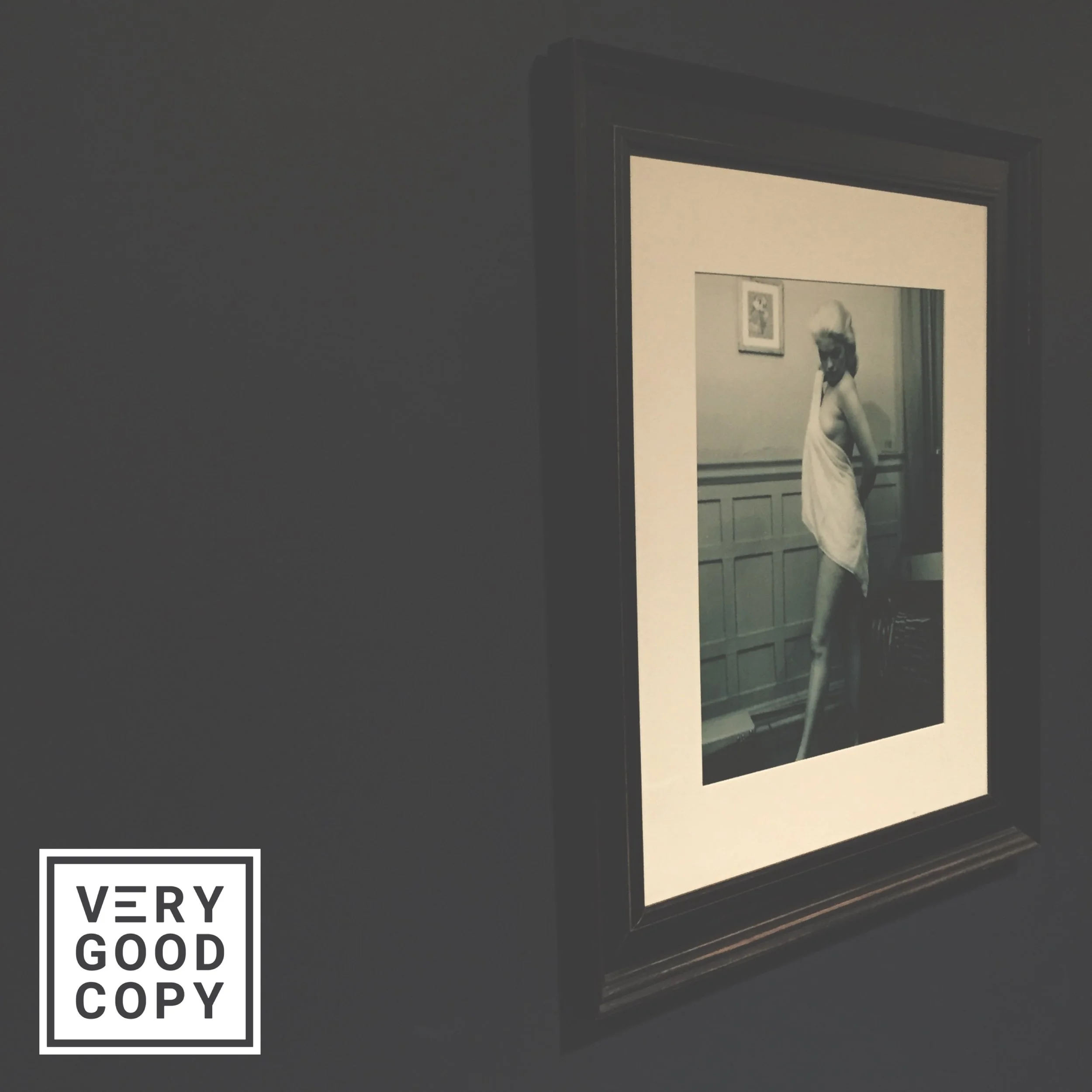
This is an old Rolls-Royce print ad.
David Ogilvy created it:

Notice how Ogilvy uses design to:
1. Focus attention on the copy
Notice how the ad splits down the middle: the left half is all art; the right half is all copy:
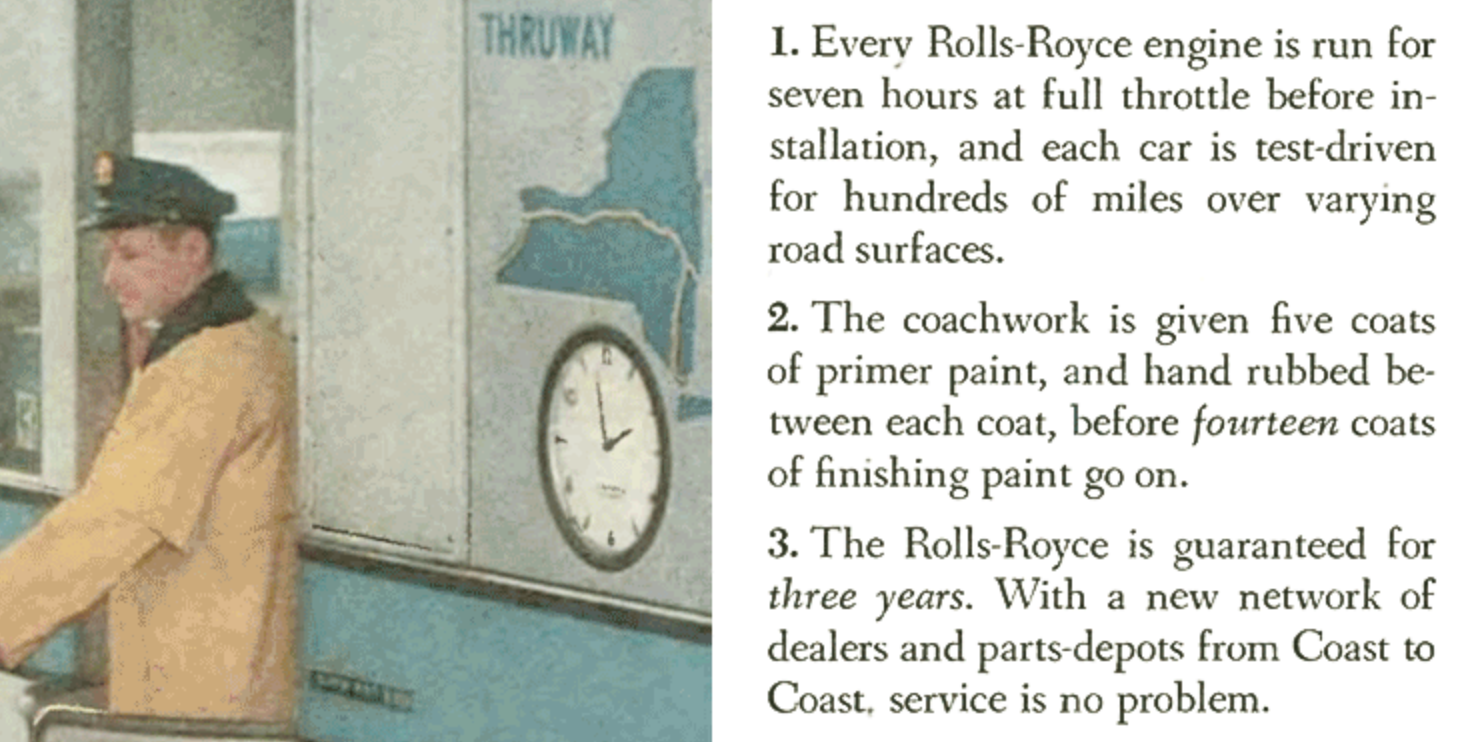
This design element forces the audience’s attention to either side. It also ensures both sides will get (at least some) attention.
Because nobody is going to glance at one side and not the other.
And a glance is all that headline needs to get read.
2. Suggest the order in which the copy is read
Notice the box in the second column:
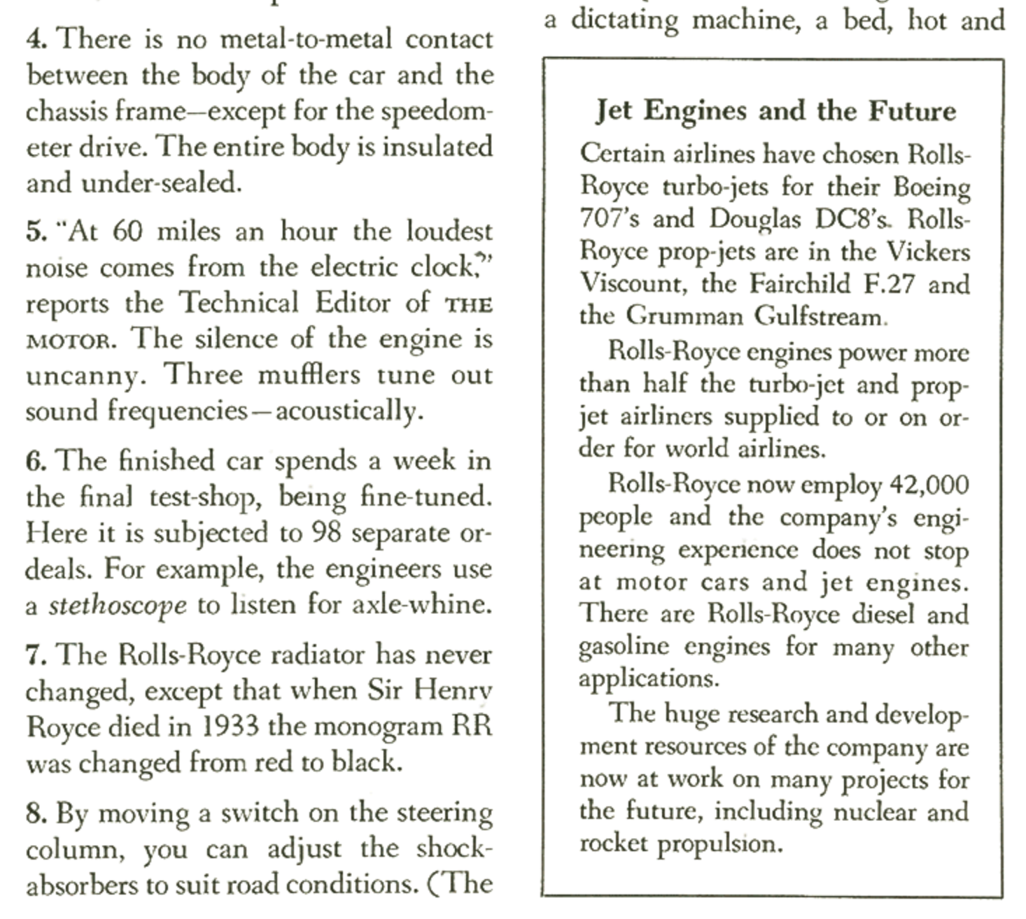
This simple-yet-significant design element suggests that the words inside the box are somehow more important or more valuable than the words around it.
It also attracts attention because it stands out.
So I’ll bet you 5 bucks the copy in the box gets read third, after the headline and subhead.
3. Reinforce the message conveyed in the copy
Notice how the headline reads: “No chauffeur required.”
And how the image depicts a car full of people without a chauffeur:

This design element helps the audience visualize the benefit. It helps people see themselves in the copy, which is compelling on its face.
On your desktop? Look left!
On your phone? Look down!
Seems obvious, right? It is.
Oh, by the way...
This ad ran in 1958...
And the design elements still play.
(And they always will.)
LEARN TO PERSUADE
![VeryGoodCopy [Small].png](https://images.squarespace-cdn.com/content/v1/5615edeae4b0b9df5c3d6e90/1552609256743-BQO7U0XLDQ4YDIZIO560/VeryGoodCopy+%5BSmall%5D.png)
WRITE BETTER.
MARKET BETTER.
SELL MORE.


![How copywriters put prospects in the buying mood [quick trick]](https://images.squarespace-cdn.com/content/v1/5615edeae4b0b9df5c3d6e90/1533095575515-C2JPAZA3C46IBX00EMM8/Put+prospects+in+the+buying+mood+%5BVGC+art%5D.JPG)


COMMENT BELOW
Judge not lest ye be judged.